Friday, 4 June 2010
Monday, 17 May 2010


Wednesday, 5 May 2010
My task was to produce a campaign website for a charity. It had to include a video, logo, original photographs, written text, and an easy navigation bar. I decided to make a charity website based on Cancer Research as I have recently had an experience over looking someone close to me with this disease, so to express my feelings I have made this website to help other with their thoughts and feelings towards this stituation.
The target audience was mainly based for children as their may have difficulty expressing their feelings and understanding the situation around them. This then provides them with the information to understand the dilema of the situation and gives them contact details if they needed to talk to anyone about their problem or situation. Also it could have another target audience for adults as it also provides in depth information so they can thoroughly understand the information and gives people a chance for donations that are put towards local hospisies in their area.
My layout of my website is very simple, I have an easy but quite colourful navigation bar which is along the top of the site, my logo is in the top left-hand corner, both these things are found in a lot of websites, I’ve provided a clear and easy website for all ages to understand and look at.To help me with making my website I research some other charities websites and got some ideas of them, I also looked at the logos and how they we’re made, whether they we’re simple or quite hard logos to remember.Also I have learnt that it is definately important to research existing products (childrens charity websites) beforehand. Not only is this good for seeing what is effective, but also to get idea's for my own website. From this, I think if I had to do the project again I wouldn't use a scanned in drawing for my charity logo.By creating my website on WebPlus 10, I learnt how to create a navigation bar, by creating simple boxes and putting them together to create one rollover. Also by using the master page I was able to make sure the key features were going to appear on every page, i.e the logo, navigation bar, and donation number.
Going back to the preliminary task, this task I think has developed my knowledge more because it involved creating my own media product.
The preliminary task was useful for researching and getting a better understanding of the basic concept of website design. For example the Primary Research Task allowed me to analyze different primary school website and pick out the key features, which meant I was able to apply these to my own chairty website. The preliminary task also taught me about target audience, as looking at primary school websites meant there was a specific target audience to children and parents. Therefore this taught me that appealing to both children and adults is possible, with the mix of entertainment and useful information.
To distribute my website I will put it online and available on the internet site Google so that it is easy for my target population to view.
Monday, 29 March 2010
Photography, Composition and Non Verbal communication:
Eye flow:
Elements in the scene that guide the viewer's eye through the entire frame.

Dominant element:
Usually there is one main subject to the image.

Simplicity:
Only what is essential to the scene is included in the final image.

The Rule of Thirds:


In the first photo the subject is almost dead center, with a lot of wasted room on just about all sides. While this may be one of the most common ways to take a portrait, it’s also the most common way to take an uninteresting photo.

The second photo is the same image however this time it is cropped and makes use of the rule of thirds, the subject in this photo There is not as much wasted room, the person’s head is at the top of the frame, and thus more of the person can be seen. It also gives a sense of height.


The basis of the ages-old Rule of Thirds is that if you were to divide a frame into thirds, both ways, the points of intersection are the points where your subject should be placed in order to be most interesting. The subject’s eyes are directly lined up with the intersecting points. Any one of those four points is a great place to frame your subject.
Diagonal rule:
One side of the picture is divided into two, and then each half is divided into three parts. The adjacent side is divided so that the lines connecting the resulting points form a diagonal frame.

Non Verbal Communication:
Once you can take wonderful photos you need to start thinking about the content of them. There is an old saying that states that 'a picture paints a thousand words' this is never truer than in Media studies how we position and direct models in our pictures can communicate many things to the audience.
Expression- based on conventionalised cultural codes, instantly recognisable.
Eye contact- directly towards the consumer or involved within the scene.
Pose-static or active often corresponds to expression. Can also be a symbol of status.
Clothes-important as they communicate to the audience.
Touch- ritualistic touching conveys emotion and manner. Grasping and holding is functional.
Body movement- relates to the function that the actor is doing.
Positional communication:
Relationships between actors within the frame, the direction they are facing, the height of each can show relationships and status.
Reciprocal- a two-way relationship in which each person is the centre of the other’s attention.
Divergent- each person’s attention is diverted towards something different.
Object- the attention of each person is directed towards the same object.
Semi-reciprocal- one person’s attention is concentrated on the other, whose attention is elsewhere.
Monday, 1 March 2010
Main Task:
 This website was designed to help prevent child abuse and dsigned to help people come forward if they are being abused or no if anyone needs help.
 This website was designed to help promote individuals to donate money so that children can get easy access to sporting equipment and have a chance to do sports whatever thir background.
 This charity is funfed by donations from people all over the world as it helps children who have had problems with their lives and it promotes rights for children so that they get a say in their own lives.
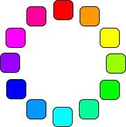 This is a normal colour wheel to show different colours. A color wheel is really just the spectrum twisted around so that the violet and red ends are joined.
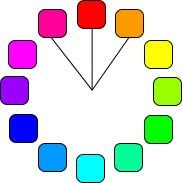 The analog colors are those colors which lie on either side of any given color. Often these are color schemes found in nature.
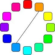 The complementary colors are the colors which are directly opposite from one another on the color wheel. Complementary colors are contrasting and stand out against each other.
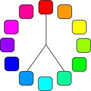 Split complementary is a color and the analogous colors to its complement color. Using split complementary colors can give you a design with a high degree of contrast.
 Triad colors are three hues equidistant on the color wheel. When you want a design that is colorful and yet balanced, a triad color scheme might be the way to go.
To produce a charity website of my own choice based on an issue that is important to me. This website can be aimed at either children or adults. I have to take into consideration what images and colour schemes will suit what age group of people. For example if I chose to design a website for children I will need bright colour and bold pictures that children can understand and make use of it.
These are some websites all ready designed charities for children are and the logos from their websites:
 This website was designed to help prevent child abuse and dsigned to help people come forward if they are being abused or no if anyone needs help.
 This website was designed to help promote individuals to donate money so that children can get easy access to sporting equipment and have a chance to do sports whatever thir background.
 This charity is funfed by donations from people all over the world as it helps children who have had problems with their lives and it promotes rights for children so that they get a say in their own lives.
What makes a good logo?
A logo needs to be understood by a wide range of people. This is particularly useful for a charity who are trying to drum up support and funds. For a logo to be easy to read they have to have a simple font and should conventionally not use more than two logos. Also it needs to be recognisable by other countries that view it. Finally, a good thing to remember when designing a logo for a company is to stick to one idea. If a company have many different disconnected versions of their logo it can confuse the audience and the logo can lose impact.
For my charity website I will be aiming it at children as they are my chosen target audience and to appeal to them I will use a bright use of colour and the images I use will be big and bold which are funny and full of energy.
A logo that would be most suitable for children would be a big, bright and colour ful logo. This is becuase if children like the look of it they will memorize this and start to look through the website. Or if it is an older child they will remember the logo and recognise that the website isthere for their own help if they need to contact someone.
Also it can be usefull for adults as the have a good memory and memorise it if they need to contact someone or give any donations.
Colour theory:
 This is a normal colour wheel to show different colours. A color wheel is really just the spectrum twisted around so that the violet and red ends are joined.
 The analog colors are those colors which lie on either side of any given color. Often these are color schemes found in nature.
 The complementary colors are the colors which are directly opposite from one another on the color wheel. Complementary colors are contrasting and stand out against each other.
 Split complementary is a color and the analogous colors to its complement color. Using split complementary colors can give you a design with a high degree of contrast.
 Triad colors are three hues equidistant on the color wheel. When you want a design that is colorful and yet balanced, a triad color scheme might be the way to go.
Monday, 8 February 2010
This is the finished web design for my chosen primary school. I will give a breif evaluation of each page that I have completed.
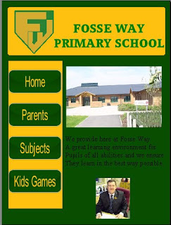 This is the first slide and the home page of my web design. On this slide there is 2 images. The top image is of the entrance to the school to show that the school is welcoming and the environment is clean and tidy. The second image is of the headmaster of the school as this shows who is in charge of the pupils well being and for their healthy learning environment.
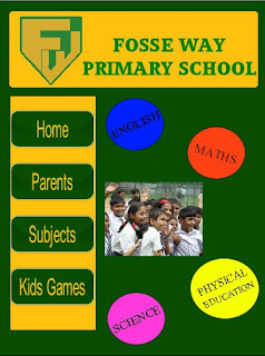 This page is the final page of my web design. This is a page where children can click on one of the circles and it provides a game for each subject but at the same time they will be asnwering academic questions so they can learn whilst having fun at the same time.
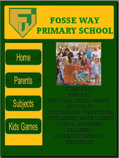 This page is for the parents of the pupils and for parents that are looking to enroll their son or daughter into our learning environment. This page provides links to speeches from the headmaster about each caption on what he and his staff will offer the pupils while learning and developing through life situations.
Subscribe to:
Posts (Atom)
