To produce a charity website of my own choice based on an issue that is important to me. This website can be aimed at either children or adults. I have to take into consideration what images and colour schemes will suit what age group of people. For example if I chose to design a website for children I will need bright colour and bold pictures that children can understand and make use of it.
These are some websites all ready designed charities for children are and the logos from their websites:
 This website was designed to help prevent child abuse and dsigned to help people come forward if they are being abused or no if anyone needs help.
 This website was designed to help promote individuals to donate money so that children can get easy access to sporting equipment and have a chance to do sports whatever thir background.
 This charity is funfed by donations from people all over the world as it helps children who have had problems with their lives and it promotes rights for children so that they get a say in their own lives.
What makes a good logo?
A logo needs to be understood by a wide range of people. This is particularly useful for a charity who are trying to drum up support and funds. For a logo to be easy to read they have to have a simple font and should conventionally not use more than two logos. Also it needs to be recognisable by other countries that view it. Finally, a good thing to remember when designing a logo for a company is to stick to one idea. If a company have many different disconnected versions of their logo it can confuse the audience and the logo can lose impact.
For my charity website I will be aiming it at children as they are my chosen target audience and to appeal to them I will use a bright use of colour and the images I use will be big and bold which are funny and full of energy.
A logo that would be most suitable for children would be a big, bright and colour ful logo. This is becuase if children like the look of it they will memorize this and start to look through the website. Or if it is an older child they will remember the logo and recognise that the website isthere for their own help if they need to contact someone.
Also it can be usefull for adults as the have a good memory and memorise it if they need to contact someone or give any donations.
Colour theory:
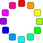 This is a normal colour wheel to show different colours. A color wheel is really just the spectrum twisted around so that the violet and red ends are joined.
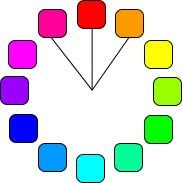 The analog colors are those colors which lie on either side of any given color. Often these are color schemes found in nature.
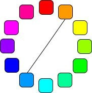 The complementary colors are the colors which are directly opposite from one another on the color wheel. Complementary colors are contrasting and stand out against each other.
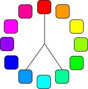 Split complementary is a color and the analogous colors to its complement color. Using split complementary colors can give you a design with a high degree of contrast.
 Triad colors are three hues equidistant on the color wheel. When you want a design that is colorful and yet balanced, a triad color scheme might be the way to go.
No comments:
Post a Comment